Neighbourhood Statistics: User Guide
Main Content
Standardised Data
Most of the data available on Neighbourhood Statistics are count data. In other words, for each geographic area they show the total number of instances of each item of interest (for example, people in a specific age group).
For example, comparing local authority data from the 2001 Census there were:
- 52,000 people aged 65 and over in Manchester; and
- 22,000 people aged 65 and over in Eastbourne.
These count data are useful if you need to know the total numbers of people in this age group - this could be important when planning service provision. However, if you are trying to compare the concentration of different age groups in different areas of the country, they are less helpful. Manchester clearly has many more people aged 65+ than Eastbourne, but it also has a much higher total population: 390,000 compared to 90,000. This means that the count data are not a good measure of concentration.
More useful are measurements which take into account the unequal population size of different geographic areas. These measurements are referred to as 'standardised', and include statistics such as percentages, rates, averages, and densities. For example, comparing the Manchester / Eastbourne data in percentage terms:
- 13 per cent of people in Manchester are aged 65 and over; and
- 25 per cent of people in Eastbourne are aged 65 and over.
In other words, although Manchester has a higher total number of people aged 65+, it is Eastbourne which has a much higher percentage of people in that age group.
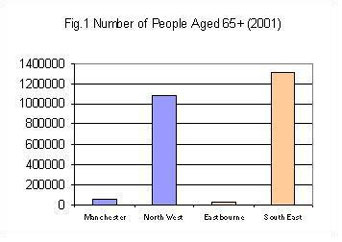
The advantage of using percentages over counts is greater still when comparing different levels of geography. Suppose, for example, you wished to draw a bar chart comparing the numbers of over 65s in Manchester local authority compared to the North West region, and also Eastbourne local authority compared to the South East region. Figure 1 shows the bar chart you would get using count data, whereas Figure 2 uses percentages.


From Figure 1 it is clear that there are many more over 65s in the North West and South East than in Manchester and Eastbourne, and that the South East has most of all. This is unsurprising, however, given that it is also the largest area in terms of total population. In addition the very small size of the bars for Manchester and Eastbourne makes it difficult to estimate a value for them at all.
Figure 2, however, provides a much more meaningful picture in terms of comparison. By using percentage figures it shows that Manchester has relatively fewer over 65s than the North West region, whilst Eastbourne has a markedly higher percentage than does the South East. It also shows that there is little difference between the North West and the South East in terms of their percentage of over 65s, demonstrating that most of the difference shown in Figure 1 is indeed caused by the different size of the regions.
Types of standardised data
There are a number of different types of standardised data on the Neighbourhood Statistics website, including:
- Percentages - eg dividing the number of over 65s by the total number of people in the area and multiplying by 100 will give the percentage of the population who are over 65.
- Rates - eg dividing the number of burglaries by the number of households in the area and multiplying by 1000 will give an offence rate per 1000 households.
- Averages - eg dividing the number of people in an area by the number of households will give the average number of people per household.
- Density - eg dividing the number of people in an area by the size of the area will give population density.
When to use standardised data: summary
Standardised data are useful:
- When comparing the relative characteristics of areas with differing population sizes.
- When comparing different values within a single area (eg percentage of people in each age band).
This is because it is often easier to interpret rates or percentages than long strings of digits. On the other hand, if it is important that you know the total numbers in any given group, you should use the raw count data.
Standardised data and thematic maps
One area where the use of standardised data is particularly important is in the production of thematic maps. This is because using count data can easily give a misleading impression. Consider the following two maps of local authorities in the North East region. Both use the same dataset from the 2001 Census, but the first map shows the total number of 45-59 year olds in each area, and the second shows the percentage of people aged 45-59 in each area.
Figure 3: Total number of people aged 45-59

Figure 4: Percentage of people aged 45-59

The same raw data, but a very different impression! The darker colours imply higher concentration, so casual users of the first map might be misled into thinking that people are more likely to be aged 45-59 in the industrialised eastern part of the region. The second map, however, reveals the reverse to be true. It is actually the rural western parts of the North East that have a higher share of people in this age group. It is only because these rural local authorities have a much smaller total population that their total number of people aged 45-59 is also much lower.
Depending on the geography or the dataset presented and type of map used, there may be occasions when it is more appropriate to present maps of count data. For inter-area comparisons standardised data are generally much more meaningful and it is good practice to use them.
