You are here:
- Home Page
- > User Guide
- > Detailed Guidance
- > Case Studies
- > Census Area Classification
Case Study: Classification
Main Content
Understanding the Census Area Classification for Output Areas
Introduction
Neighbourhood Statistics is more than just a data warehouse; it also contains tools that allow the investigation of one, two or a multitude of areas. One of these tools is the Census Area Classification.
This study will highlight how the most recent of the classifications, the Output Area Classification, has been created. It will also investigate what the classification can show, and highlight its potential uses. This case study is also available as a pdf document (308Kb).
The Area Classifications
Area Classifications are produced for different geographies and are used to group together areas with similare characteristics. These groupings are called clusters, and are derived using census data.
The classifications are used by government departments and academics for analysis and comparison, and can also be used by members of the public and school pupils for finding out about the area where they live and how this compares with the rest of the country.
2011 Area Classifications
An external partner, University College London has produced an updated 2011 Census Output Area Classification for the UK on behalf of ONS, using 2011 Census data.
Following this release, ONS is now looking to update the current 2001 Census-based UK area classifications for super output areas/data zones, local authorities, and health areas using 2011 Census data. Consideration will also be given to updating the previous ward area classification.
As part of the methodology review for a new output area classification, thought will be given to periodically updating the 2011 Census based area classifications in the future using non-census data sources.
2001 Area Classifications
The 2001 Area Classifications for Local Authorities was updated in March 2010 to take account of the unitary authorities created in April 2009. Details can be found in the March 2010 Area Classifications Update.
Understanding the Output Area Classification
The Output Area Classification has been constructed by creating a hierarchy of clusters, which together typify the characteristics of a given area. There are three layers of the classification that make up the hierarchy. The three layers are:
- Supergroup - the first layer
- Group - the second layer
- Subgroup - the third layer
The first layer to be created is the top, 'Supergroup' layer. The Supergroup layer is constructed by applying an algorithm to each individual Output Area across the UK. The members of one Supergroup are distinguished from members of another Supergroup by their unique combination of characteristics captured by the Census. For example, one Supergroup may have a combination of characteristics that you might expect from city areas, such as larger proportions of flats and private renters.
Another Supergroup may have a combination of characteristics like those you might expect to find in more rural areas, such as large proportions of detached housing, households with two or more cars etc. It is the combination of these characteristics that generates the distinct differences between the Supergroups.
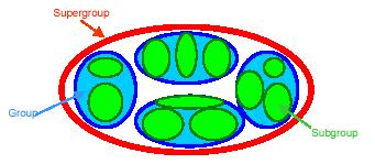
Once the Supergroups had been created the remaining two layers were generated within each Supergroup. By using figure 1 we will explain the structure of the classification.
A Supergroup is represented by the red area in figure 1. To form the second layer of the classification, the clustering algorithm was applied to each of the Supergroups in turn. This created the second, 'Group' level of the classification. This is shown as the blue areas in figure 1. Finally the algorithm was run on each of the Groups to create the third layer of the classification the 'Subgroup' level. Subgroups are shown by the green areas in figure 1.
The Groups and Subgroups within a Supergroup provide more specific detail about the members of a Supergroup. If we consider the example of the city areas from before, the Groups within this Supergroup may help distinguish between particular characteristics such as owned and privately rented flats.
To fully understand the differences between the Supergroups, Groups and Subgroups, 'Cluster Summaries' have been produced. These will be investigated later in the study.
Figure 1: The structure of the Output Area Classification

Developing a top down approach like this helps to highlight the most important level of the hierarchy. The topmost, Supergroup level, is seen to be the most important as it highlights the clusters that are present across the whole of the UK. With these, the Groups and Subgroups can be used to help highlight the more in-depth characteristics.
For more information about the Output Area geographies, see the study 'Geography, an important factor in data analysis', which describes the geographies of Neighbourhood Statistics data.
How do the layers interact?
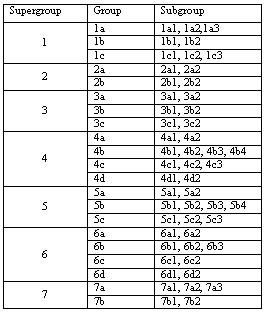
The table below shows how each of the Supergroups are divided into Groups and Subgroups.
Table 1: The division of Supergroups and Groups

From table 1 we can see that there are a total of seven Supergroups, 21 Groups and 52 Subgroups that make up the classification.
As part of the National Statistics product, none of the clusters were given descriptive names.
What does the classification show?
As the classification has been created specifically for the Output Area geography, we are able to map this classification across the whole of the UK. By mapping the data we can bring the classification to life, give it meaning and develop our understanding of small areas.
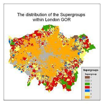
Let us consider the geographical area of London Government Office Region (GOR). Map 1 below shows the distribution of the seven Supergroups within the London GOR.
Map 1: Distribution of Supergroups within London

We can see from the map that London GOR contains Output Areas that are members of each of the seven Supergroups. The map highlights the geographical spread of the Supergroups.
The map also highlights two key points of the classification. Firstly, that in general the Supergroups appear to be grouped by their geographical location. This reveals how the social-demography differs over a wide area. In this case we can see distinct areas of London that appear to be members of the same Supergroup.
Secondly, and importantly, it shows that there are exceptions to this. It can be seen that there are some Output Areas that are surrounded by others not in the same Supergroup. But what does this mean? To understand why this is significant we need to fully understand the Supergroups themselves.
A key element of the classification that needs to be understood is why an Output Area is classified to a particular Supergroup. To fully appreciate what it means for an Output Area to be a member of a Supergroup we firstly need to understand the Supergroups themselves. To do this summary, information called 'Cluster Summaries' have been created.
What is a cluster summary?
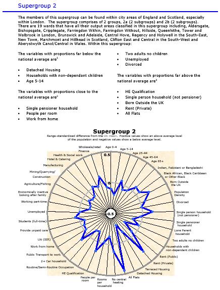
A cluster summary is a way of summarising information about a particular cluster within the classification. This cluster summary below is for Supergroup 2. It describes the social-demographic make up of the Output Areas in this Supergroup at the time of the Census. It holds information on all the Census variables used and how they compare to the UK average.
Cluster summaries have been created for each Supergroup, Group and Subgroup of the classification. Follow this link for further information on cluster summaries.
Figure 2: Cluster summary for Supergroup 2

How does this help to understand a Supergroup?
There are key pieces of information that can be seen from the cluster summary 'radar' chart. The summary shows that the three variables of Detached Housing; Households with Non-dependent Children, and 5-14 Year Olds are furthest below the UK average.
This means that we could expect the members of this Supergroup to have a lower proportion of these characteristics than across the UK.
Conversely, the variables of Higher Educational (HE) Qualification at level 4; Single Person Household; Born Outside the UK; Rent (Private) and All Flats are the furthest above the national average. This means that we might expect the members of this Supergroup to have a higher proportion of these characteristics.
Overall this helps to understand what kind of characteristics members of this Supergroup are more or less likely to have.
The radar chart itself helps us to see clearly how each of the Census variables used compares to the UK mean (average). By presenting a vast array of information in this way we can show a more complete understanding of the characteristics of the Supergroups and their Output Area members.
What is a radar chart?
Radar or spider charts are useful for comparing large volumes of information. In this example we can see that there are 41 variables present on the chart with values for both the UK average and the Supergroup itself.
To help understand the Output Area Classification further the next section will consider a local authority in the London GOR.
How the 2001 Output Area Classification can help highlight areas in a local authority.
The study will now investigate the results from the Output Area Classification in the local authority of Enfield. It will examine what the Output Area Classification tells us about this local authority.
Map 2 below shows the local authority of Enfield. The classification has highlighted three areas within the local authority that appear to be quite distinct from each other.
Map 2: Enfield and the Output Area Classification

Firstly there are those Output Areas that have been classified as being members of Supergroup 7. By using the information from the cluster summary we can see the type of characteristics we would expect members of this Supergroup to have.
Secondly there are those Output Areas that have been classified as being members of the Countryside Supergroup 3. Again, by using the information from the cluster summary, we can see the type of characteristics we would expect members of this Supergroup to have.
Thirdly there are Output Areas between these two that have been classified as a mixture of the remaining Supergroups.
If you know Enfield, this may not come as a big surprise as you would probably know some of these areas. However, would you know all of them and be able to distinguish between them? Even if you actually visited these places it may not be that obvious.
This highlights one of the key aspects of the Output Area Classification. This simple map can highlight where social-demographic differences exist within small geographical areas such as local authorities.
What else does the classification show?
Another advantage of the classification is that you can identify Output Areas in other parts of the country which have similar characteristics. This provides potential for sharing experiences and lessons learned with other areas outside your local boundaries and could be valuable when considering how to tackle deprivation issues.
The classification can be used as a geographical base. The benefit of using the classification in this way is that it can help investigate the links between the characteristics of an area to other issues such as health, crime or issues of deprivation.
The Groups and Subgroups can also be used to drill down into areas of interest. So for example, we could investigate the Groups and Subgroups of Supergroup 7 in Enfield as this would help us understand even more about the areas and the subtleties that lie within this Supergroup.
It is this diversity that makes the Output Area Classification one of the most exciting products that ONS has published. Business and marketing firms use similar products to help expand their knowledge of where to market their products. The best thing about this classification is that it enables small areas to be investigated and the different characteristics explored.
Who will benefit from the classification?
The classification has been designed to be used by government departments and academics for analysis and comparison. It can also be used by members of the public and school pupils for finding out about where they live and how it compares with the rest of the country.
But what if you are interested in larger geographies than Output Areas?
The information described here is also available for health areas, local authorities and wards.
Summary
This study has shown how the Output Area Classification has been created and how it can be used to understand small areas.
Hopefully we have also highlighted the diversity of the classification and its potential for exploring a variety of in-depth, cross-cutting issues.
Follow this link if you would like to know more about the area classifications.
