Case Study: Crime
Main Content
Using charts to understand patterns in crime
Introduction
The purpose of this study is to examine patterns of crime at different geographical levels. It will compare local authorities to regional and national trends and aims to show how to represent the outcomes graphically.
This study will be of interest to anyone wishing to understand more about crime data, or the fundamentals of charting techniques and is available as a pdf document (256Kb).
Data
The Neighbourhood Statistics website currently provides datasets on notifiable offences recorded by the police for the financial years from 2001 onwards.
The datasets have been supplied by the Home Office (HO). For this study we will focus on using the dataset for 2003-04. This dataset records counts for England and Wales of recorded offences broken down into the following categories:
- violence against the person
- theft from a car
- robbery
- theft of a motor vehicle
- burglary in a dwelling
The 2003-04 dataset is the first dataset available on the Neighbourhood Statistics website which records crime in accordance with the National Crime Recording Standard (NCRS) introduced in April 2002.
It does not measure the overall levels of crime in England and Wales during 2003-04 as it excludes the following:
- minor summary offences.
- crimes which did not come to the attention of the police. The British Crime Survey (BCS) can do this, but not at the local authority level because of the limitations in sample size
- data here only show the key and not all notifiable offence.
The NCRS was implemented to provide more accuracy, integrity and consistency in police recording across the country. However, this framework does have limitations and can be influenced by local policing and recording practices.
What can we do with the data?
By using the data on counts we can calculate the type of crime recorded as a percentage of recorded crime. The results can be displayed in different types of chart.
Charting techniques
Different types of charts will be used to help highlight patterns existing within the crime counts. Examples are included below to illustrate patterns occurring at the England and Wales, regional and local authority levels. Details of the charts used can be found in the What is? at the end of each section.
The England and Wales picture
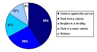
Firstly we can see the breakdown of crime at the highest level of geography for the data, England and Wales. The pie chart below considers the proportion of notifiable offences of each type.
Figure 1: Key recorded notifiable offences in England and Wales by type of crime for 2003-2004
What does the chart show me?
The pie chart above shows that violence against the person was the crime type that accounted for the largest percentage (41 per cent) of key recorded offences in England and Wales for the financial year April 2003 to March 2004. This was followed in descending order by theft from a vehicle (26 per cent), burglary in a dwelling (17 per cent), theft of a motor vehicle (12 per cent) and robbery (4 per cent).
But what does this mean?
In doing this initial analysis we have now created a base against which we can measure all subsequent analysis. This will add understanding when considering a region or local authority district. It will be straightforward to tell if any of these areas have higher or lower percentages of a given crime when compared to England and Wales.
What is a Pie Chart?
Pie charts are most appropriate for giving a general overall picture, for situations where we want to illustrate the relative sizes of parts of a total.
Tips for constructing a pie chart
- Avoid too many segments (generally, four to five is a maximum).
- Label each segment clearly.
- Organise the segments clockwise and in descending size order.
- Begin the segments at the 12 o'clock position.
- Colour the segments from dark to light, starting from the 12 o'clock position.
- Avoid 3 dimensional pie charts as they can show a misleading impression of segment size.
The regional picture
Having now created this base at the England and Wales geographical level, we can move the analysis on to investigate if this pattern is repeated in the 10 regions.
Figure 2: Recorded crime types in the regions of England and Wales for 2003-04

What does the chart show me?
The stacked bar chart above shows the percentage of different recorded crime types for the ten regions of England and Wales. The pattern of crime that occurred at the regional level was similar to that for England and Wales. For all regions, violence against the person accounted for the largest percentage of each region's total recorded crime. For all regions, this was followed in descending order by theft from a motor vehicle, burglary in a dwelling, theft of a motor vehicle and robbery.
Table 1: Table showing different types of crime by region
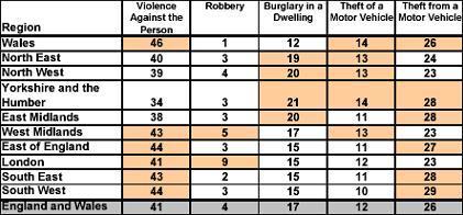
This table shows how the regions compared with England and Wales. The highlighted cells show regions that have a greater percentage for a given crime type than England and Wales as a whole.
Table Summary
Compared to England and Wales (41 per cent), Yorkshire and the Humber recorded the lowest percentage (34 per cent) of violence against the person and Wales recorded the highest percentage (46 per cent) of violence against the person.
Compared to England and Wales (4 per cent), Wales recorded the lowest percentage (1 per cent) of robbery and London recorded the highest percentage (9 per cent).
What is a stacked bar chart?
A stacked bar chart can be used to show more than one category within each variable.
Tips on stacked bar charts
- With stacked bar charts it is difficult to judge the relative sizes of the categories shown between the top and bottom categories.
- The more variables and categories used, the more difficult the chart is to read.
The local authority (LA) level picture
We know that there are some differences when comparing the regions with England and Wales. We will now consider an even smaller geography, LAs.
For the following section we have chosen an area (South Buckinghamshire) that has a different pattern to those presented at the regional and national level.
This is to show that there may be underlying patterns present in data that are not visible at high levels of geography.
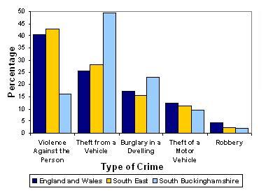
Figure 3: Recorded crime types in England and Wales, South East and South Buckinghamshire for 2003-04
What does the chart show me?
From the grouped bar chart we can see that the pattern of crime that occurred in the LA of South Buckinghamshire was different to the pattern that occurred at the South East regional level and the England and Wales level.
For violence against the person it can be seen that South Buckinghamshire's 16 per cent is less than half that in the South East region (43 per cent) and England and Wales (41 per cent). Compared to theft from a motor vehicle South Buckinghamshire's 49 per cent is nearly twice that found in the South East region (28 per cent) and England and Wales (25 per cent).
Compared to all other local authorities in England and Wales, South Buckinghamshire recorded the lowest percentage of violence against the person and the highest percentage of theft from a motor vehicle. The next section will show local authorities that have similar levels of these two crimes to those found in South Buckinghamshire.
What is a grouped bar chart?
A grouped bar chart can be used to illustrate two or more categories for a given variable.
Tips for constructing a grouped bar chart
- A grouped bar chart is suitable for showing two or three categories. If a greater number of categories are used it can be difficult to read. This means you can illustrate fewer variables than you could on a standard ungrouped bar chart
- Avoid the use of overlapping bar charts, they can save on space but are more difficult to read.
Crimes across local authorities
There are two types of analysis that can be done when looking at crime across local authorities. Firstly we will investigate one type of crime and those local authorities that have similar percentages. Secondly we will consider the geographical location of a local authority and investigate the crime in the surrounding local authorities.
First we will consider areas that have a similar percentage of a given crime. This will show local authorities that have a similar percentage of a crime no matter what their geographical distribution.
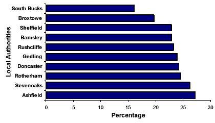
Figure 4: Local authorities with the lowest percentage of violence against the person for 2003-04.
What does the chart show me?
The chart above includes the ten local authorities that recorded the lowest percentage of violence against the person. South Buckinghamshire (South Bucks), recorded the lowest percentage (16 per cent) and Broxtowe in Nottinghamshire recorded the second lowest percentage (19 per cent).
Figure 5: Local authorities with the highest percentage of theft from a vehicle 2003-04.

What does the chart show me?
The chart above includes the ten local authorities which recorded the highest percentage of theft from a vehicle. South Buckinghamshire recorded the highest percentage (49 per cent) with East Dorset recording the second highest percentage (45 per cent).
We can now extend this analysis to show the local authorities that surround South Buckinghamshire and the percentage of violence against the person and theft from a vehicle that they had.
Figure 6: The percentage of violence against the person for the local authorities that surround South Buckinghamshire

What does the chart show me?
The above chart shows the percentage of violence against the person for South Buckinghamshire and neighbouring LAs. South Buckinghamshire's 16 per cent is nearly half that of Windsor and Maidenhead (28 per cent) and over a third of the percentage found in the South East (43 per cent) and England and Wales (41 per cent).
Figure 7: The percentage of theft from a vehicle for the local authorities that surround South Buckinghamshire
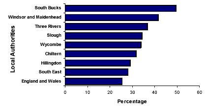
What does the chart show me?
The above chart shows the percentage of theft from a vehicle for South Buckinghamshire and neighbouring LAs. South Buckinghamshire's 49 percent is 7 percentage points higher than Windsor and Maidenhead and 24 higher than the percentage found across England and Wales.
This type of analysis has shown two ways of identifying hotspot areas. It could also be used as a way of showing how initiatives affect crime in a hotspot area and if there is a knock-on effect within the surrounding areas, although data over time would be needed.
What is a horizontal bar chart?
A horizontal bar chart is where the frequency is placed on the horizontal axis instead of the vertical axis. The variable names are placed on the vertical axis. There are two main reasons why we might choose to use a horizontal bar chart rather than a vertical bar chart
- When the names of the variables are relatively long, (too long to fit underneath each variable in a vertical bar chart).
- When there are many variable values (in the example above there are 9 variable values).
- Ordering the bars in a horizontal chart can make it easier to read and compare the different variables.
Can we combine these data with other data sources?
Within the last section we generated hotspot analysis that highlighted local authorities with a high percentage of a given crime and also how an individual local authority compares to its surrounding area.
Within this analysis however it is unclear if the areas that have similar percentages of crime do have similar crime rates. To investigate this further we need to consider a way of generating a value that will allow a comparison. To do this we need to consider the use of different data sources.
In using different data sources we need to be clear about what we are trying to measure. For example, rather that investigating the percentage of burglaries an area had we may wish to know the number of burglaries there were as a rate of the number of houses. This creates a value that can be compared both across and between geographies, in essence creating an indictor.
An indicator, in its rawest form, is a percentage or rate that allows comparison across different areas. The difficulty in creating an indicator is finding an underlying dataset that captures those at risk of the event happening.
To understand these issues we will reconsider our crime data and investigate the limitations and issues that surround the use of other data to create an indicator.
Population data
It would be straightforward to generate an indicator that shows the crime rates per 1,000 resident population. But is this correct?
We need to consider if this population data is representative. For the crime data we could argue that the resident population figures wouldn't be representative because the actual population for a given area at a given time will be different from the resident population, because of people travelling to and from the area for work or recreation.
For example, the crime figures record violence against a person whether or not they live in the area. So for the London region, with its large numbers of commuters and tourists, the resident population dataset would provide a figure smaller than the real number of people in the city (especially in the daytime). This could result in the rate of violence against the person recorded in London being overstated. On the other hand, a suburban area where many of the residents travel elsewhere for work or leisure, may see its crime figures being understated on the same basis.
Household data
If we were to create an indicator for burglary in a dwelling using population data we come across similar issues. However, if we consider household data instead of population data we get a much more representative indicator. This is because burglaries of this nature are specific to houses, so if we used accurate counts of the number of dwellings we could produce a more reliable indicator.
Other data sources
Generally these sort of issues need to be thought about when trying to compare areas. We need to be sure that we are capturing everything that is at risk of this event happening (i.e. all people, all dwellings or another appropriate measure) otherwise our indicator may be over or underestimated. This then makes the comparison across areas very difficult.
Summary
With the 2003-04 dataset on recorded notifiable offences we have used examples of basic charting techniques to illustrate the key patterns in crime at the national, regional and local authority district level.
We have also discussed issues that need to be considered when combining datasets from different sources to construct indicators of crime.
